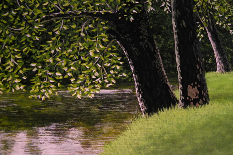
It is great to be able to blog again. I want to take one painting and go threw the whole process, step by step, in detail to get across all that goes into a great painting. You can master the techniques in order to create photo realism but if the subject or composition are not strong all that effort will not be appreciated to its full potential. I feel that an acrylic painting needs to have a strong composition so that it can stand alone without a frame. With watercolor you can add several mats and a frame that fits that particular painting and it can pop . However, with acrylic and oil paintings all you have is the frame, which to me is a plus, but the composition has to be strong.
In this post I want to discuss in detail the composition of this one painting, “Thoughtful Spot”. I will begin with the original photo that I took and then cropped. A digital camera with 12 mega pixels or higher is one of the best tools for a realism artist. You also need a computer, a good photo program and a good printer.
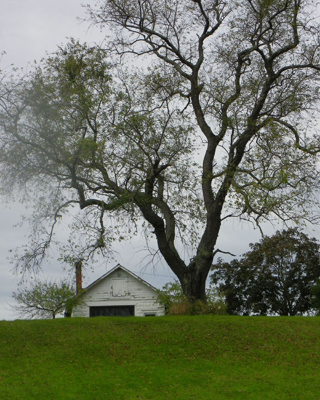
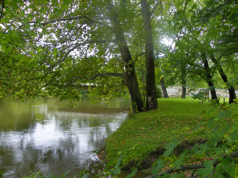
Here is the original photo I took with my Kodak EasyShare Z980 camera.

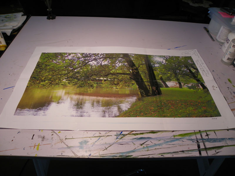
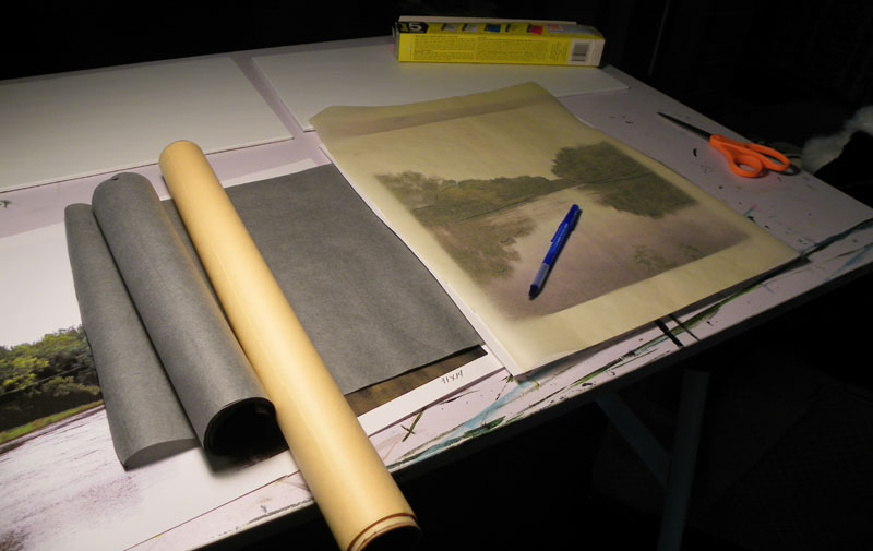
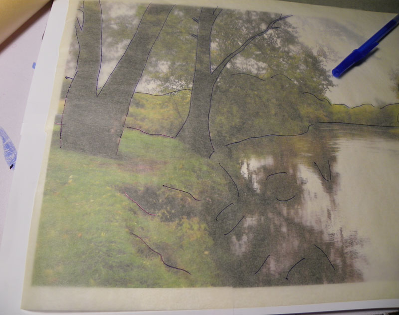
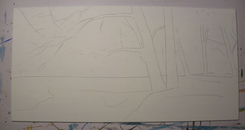
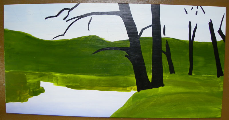
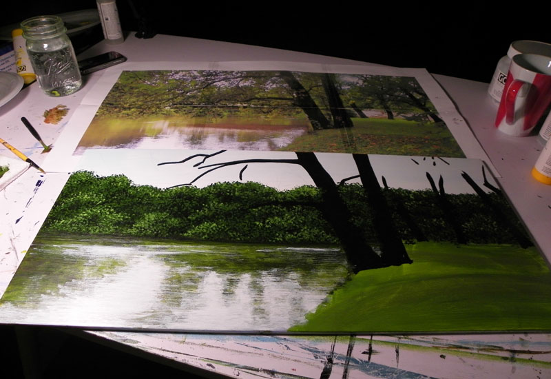
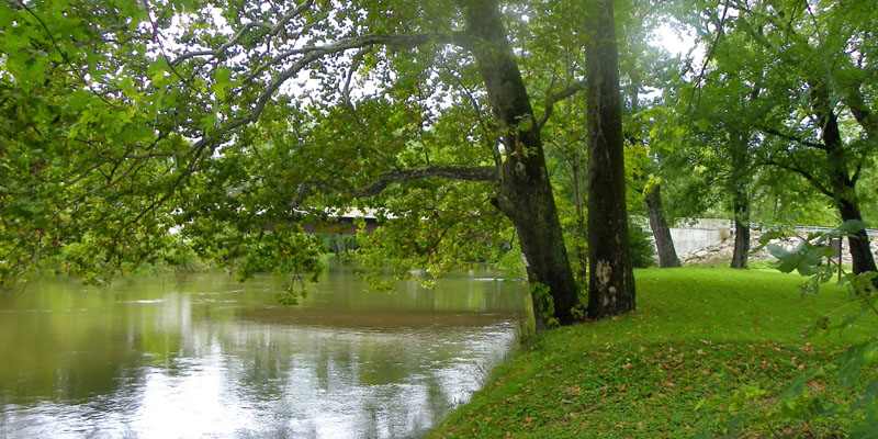
With the digital image and a good photo program you can then crop the picture into a strong composition to paint. It is rare for me to use the picture exactly as I have taken it. I like to crop the image into several possible compositions and sizes of paintings and then choose the one that I think will make the best painting. I use Adobe Photoshop and have for years. I like to crop it into the same size that I am going to paint and them print it off to use as a reference. This is helpful if you like to paint detail as I do. This next image is the one that I cropped for the painting “Thoughtful Spot” and it is the one that I printed off on my printer in an image that is 12″ x 24″. The Adobe Photoshop program will print it off for me in several sheets of paper that I then cut with a paper cutter and tape together. I like to use the shiny scotch tape because the image is clearer with this tape. I cropped four different possible paintings and chose the image below. Of course I only print out the one composition that I have chosen to paint.

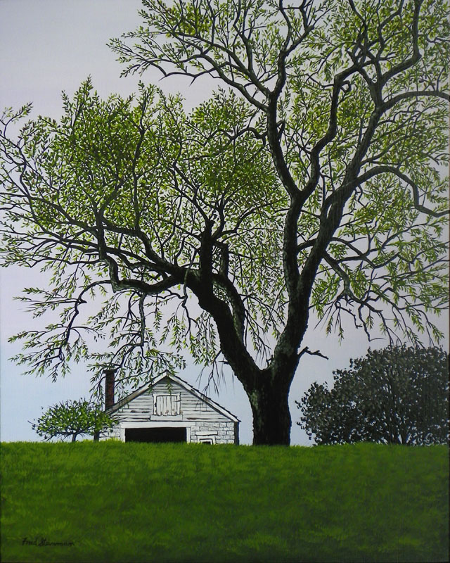
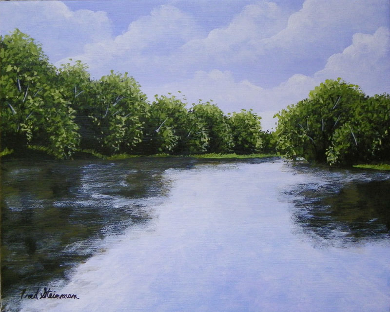
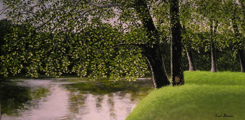
Here is the painting that I painted from this photo.

This painting is titled “Thoughtful Spot” and is 18″ x 30″ framed.
(Please keep in mind that the photo of this painting was taken in artificial light. Because of the glossy protective finishes that I put on the originals after they are done they do not photograph well. You usually see a glare on some part of the photo. The amber color in this photo is not in the original. It is lighter and the white in the sky and water is more like the original photo.)
Keep in mind that when you are using the photo program you can also adjust the photo and add contrast, brighten it a bit as I did in this case or even adjust the color. I do all of that with different photos in order to get the feel that I want.
As you can see there are still some adjustments that you may want to make in the final painting. In this one I did not add the bridge in the background. It was early fall when I took the picture but wanted to paint a summer seine. I also added some sunshine on the tree trunks to help the trees stand out and add some warmth to the painting. You can also see that by having the picture the same size as the painting you can add the detail like the detail in the tree trunks and branches that help to make the painting.
In a later blog I will go into more detail about composition but I would like to make one more point here. You want to have at least one center of interest in your painting. This is a place in the painting that causes the viewer to pause and focus on different interesting places that their eye naturally wants to linger. This along with the ability to paint light will be what makes the viewer linger on your painting when it is hanging in an art gallery over other paintings that may be next to it. In this painting there are three or four centers of interest. As you can see the main one is the two tree trunks on the river bank. The second one is the grass on the bank, after your eye first goes to the two main trees, it then goes to the grassy bank and your eye pauses there for a moment, after which it goes on to the next center of interest which is the water and its reflections. After pausing there a bit your eye goes back to the trees and then the bank and then the water again, only to then see the last center of interest which are the three trees on the bank in the background. After pausing there a bit it then goes on to what is not seen and you begin to daydream about what is just beyond the bend in the river and you have found that in this interaction with the centers of interest you have placed yourself into the painting.
This brings me to another point that I would like to make about composition. You want to keep the eye of the viewer on the image. You do not want their eye to be drawn off of the image, right onto a painting in an art gallery that is next to yours. Once you catch their eye, you want to keep it on your work for a while. In the paragraph above, I mentioned the forth center of interest which was the three trees in the background that caught your eye and then you would start to daydream and wonder what was around the bent. If the tree to the fare right was angled to the right instead of the left it would at that point pull your eye off of the image. Instead as you begin to daydream and get to that point with your eye the tree angled to the left pulls your eye back into the painting. Two more points, first the two main trees in the first center of interest, as your eye focuses on them with the way they are angled, the one to the right pulls your eye to the grassy bank and then the one to your left with its slant to the left along with the first tree branch pulls your eye to the water. Then the reflection in the water to the left with the point of the V in the reflection, pulls your eye right back into the painting onto another center of interest. If the two main trees were angled toward each other your eye would go two that point where they meat and stop without flowing onto another center of interest. Also if the V in the reflection was pointing the other direction it would pull your eye right off of the painting.
This is not something that the viewer is awaire of in most cases, but is a very important aspect to consider when deciding on a strong composition.
If you look at the original photo that I used to crop for this painting you will see a tree to the fare right that is angled too sharply to the left. I cropped this tree out of the painting because it would have been a negative center of interest that would have been distraction to the composition and would have been in contrast to the relaxing and peaceful mood of the painting. When my eye went to these two trees they just stopped. I could not get them to move at that point. You don’t want the viewers eye movement to just stop or they will also move onto another painting that just might happen to be next to it in a gallery. You want the eve movement to continue so that they linger a wile with constant eve movement.
As you can see a lot of thought goes into the composition of a great painting. One more thing that I thought about was putting a fisherman in the painting. I have not put people into my paintings yet but have been thinking about doing so. After thinking about it for this painting I came to the conclusion that I wanted the viewer to see an inviting, sunny, grassy bank that would make them want to linger a wile. I have found myself feeling like I had to move on when I go fishing and find a beautiful spot to fish, if it is already occupied. I didn’t want the viewer to get this feeling when viewing the painting and not inter in.
This is a lot to take in, at least it was for me, but as your mind dwells on this topic you will be able to comprehend these concepts and it will become second nature to you in time.

One last thought about your eye being drawn into the painting. The detail that is put into the individual blades of grass draws your eye into the center of the painting. By not putting the same level of detail into the lower right hand corner of the painting, where there is also grass, helps to draw the viewers eye to where you want it to go. Different levels of detail also have an effect on the eye movement of the viewer.
